Skype is getting another redesign with new themes and features

Skype’s had more redesigns in the past five years than I’ve had hot dinners, but Microsoft is still ready to try and tweak things once again. The software maker is teasing plans for an “improved, faster, reliable, and super modern-looking Skype.” Microsoft says it has been listening to feedback and, over the next few months, will start rolling out changes to modernize Skype.
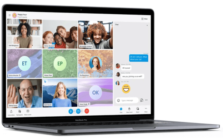
The most important part of Skype, what Microsoft calls the call stage, is getting the most attention. The grid that’s displayed during calls will soon include everyone on a call, regardless of whether they have enabled video or not. This puts all participants side by side, including your own video in the main interface.
Microsoft is also adding new themes and layouts to this view, offering some much-needed customization to the main calling interface in Skype. You’ll be able to pick between speaker view, grid view, large gallery, Together Mode, and even a content view — with options to only show people with video enabled.
Skype’s new colorful themes will soon be available, with button gradients, an improved side panel on mobile, and Fluent Design icons throughout the apps. Skype users without avatars will also get colorful gradients to make it easier to tell chats apart.
It’s not all just design changes, though. “While we love the design changes, we knew they weren’t enough,” admits the Skype team in a blog post detailing the changes. “We needed to focus on performance to make the experience delightful.” Microsoft claims it’s increasing performance on the Android version by more than 2,000 percent in “key scenarios” and 30 percent on desktop versions of Skype.
Microsoft is also making a commitment to support all browsers with its future Skype changes. “We believe the Skype experience should be seamless, accessible, and reliable no matter what browser or device you are using, so we are adding support for all browsers,” says the Skype team. “We would like to make sure that no matter which device, platform, or browser you’re using, Skype will always give you a great experience.”
Some of these improvements are live now, while others will roll out in the coming months. Custom notification sounds are part of the immediate new features, while a new TwinCam feature that lets you add your phone camera to a call appears to be coming later.
Microsoft is certainly focusing on a wide range of improvements for Skype. This is the latest redesign of Skype since Microsoft started tweaking things initially in 2014, followed by a Snapchat-like design in 2017, another redesign in 2018 that killed off the radical Snapchat-like changes, and lots of changes to the desktop and mobile apps ever since.
It’s surprising to see yet another redesign, albeit a modest one. Microsoft has signaled a shift in focus towards Microsoft Teams over the past year, with attempts to entice consumers into Teams. Microsoft’s struggles with Skype created a Zoom moment at the beginning of the pandemic last year, and the company has tried to leverage Teams and its free all-day video calling as an answer to Zoom for consumers.


